Artwork Dos and Don’ts
September 18, 2019
Artwork can be the jumping point that sets the tone in the beginning of the project or the finishing touch at the end. Placement of the piece can make or break the room too. Here are our top tips and tricks for nailing it every time!
Do — Make sure the artwork speaks to you! It might sound obvious, but artwork was created to stir emotion in the viewer. If you are drawn to a piece on some subconscious level, it’s probably going to be a piece you cherish. From vintage photography to abstract oil on canvas, it’s all good if you love it!
Don’t — Buying copies of famous artworks is ok if you are in high school, but don’t expect to be taken seriously with Van Gogh’s Sunflowers on your wall . General rule is, if it’s in a Museum’s permanent collection under maximum security, don’t try to incorporate it in to your home design. If you love Monet’s landscapes, then look for a contemporary artist that paints landscapes in a similar impressionist style. Original artwork can be expensive, so if you’re on a budget try flea markets or estate sales. Sometimes some great treasures are found!
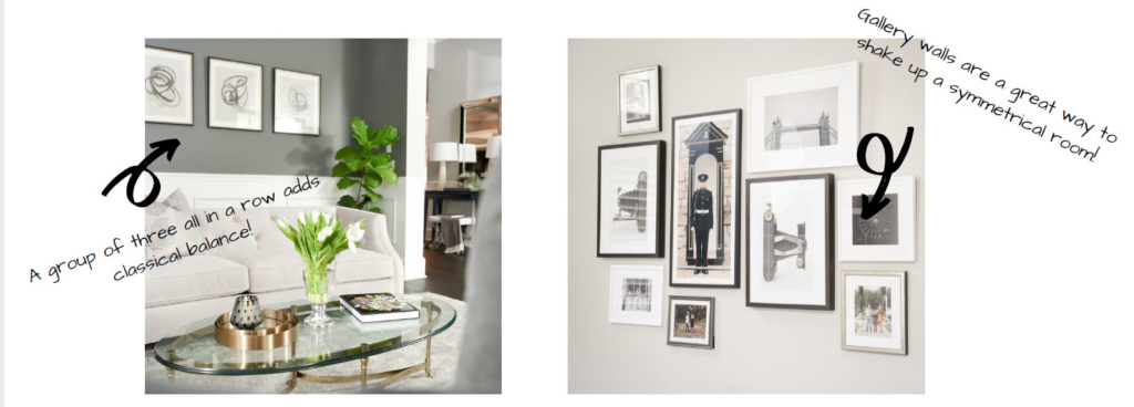
Do — Double check the size of the artwork. Scale and proportion are everything in design. A large seascape oil painting is going to have a different visual effect than a large graphic abstract canvas. We like to scale down in size more traditional artwork. A classical portrait in oil will sit nicely on a shelf. Alternatively, a tone-on-tone abstract wearing a single slash of color would work well as the main focus piece, so we size up.
Don’t – Going overboard on elaborate frames can be overkill. The purpose of the frames is to complement the art, cut not compete with it. Playing it safe with a simple, clean-lined frame will work 99% of the time. Primary colors are not meant for frames. Instead opt for neutral colors, such as black, white, and taupe. Metal color frames change with current trends more quickly. Choose timeless metal finishes that complement your room’s finishes.
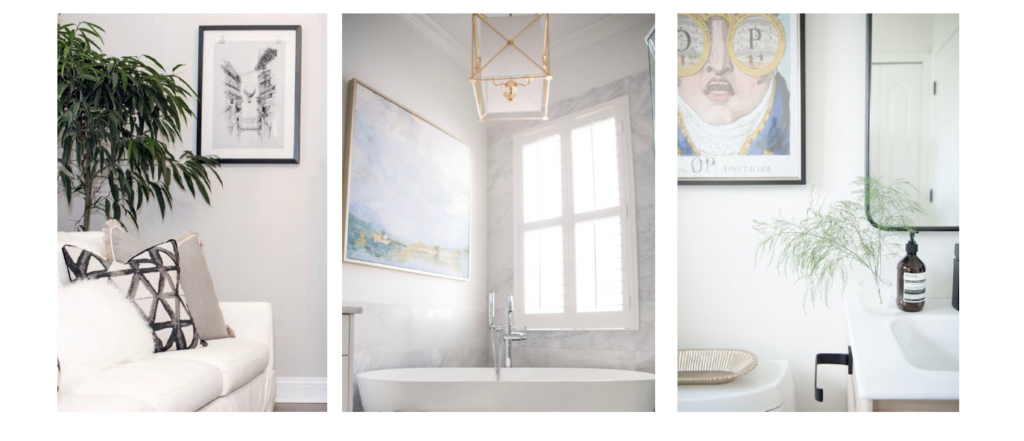
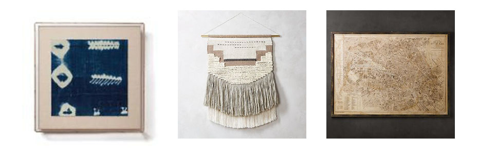
Do – Consider alternative mediums of art for framing. Not all artwork is made by paint brushes! Global inspired textiles are making a splash right now and we are obsessed! Old maps can be very masculine and chic in an office. Woven wall hangings can bring a boho flair, while framed, vintage army buttons are a conversation piece.
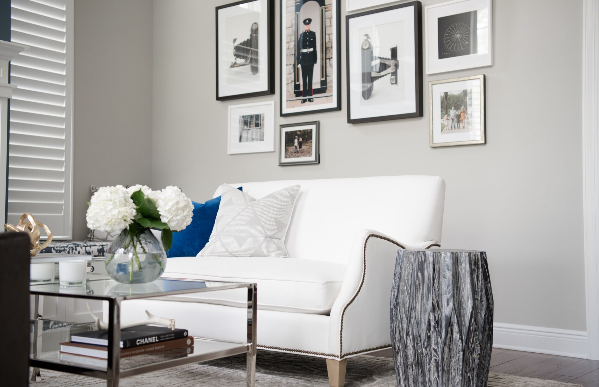
Don’t – Grouping related pieces too far apart looks disjointed. When installing two or more coordinating pieces together, they need to have just a tad of space (try 3”) between them. For more complex gallery style groupings, where multiple shapes and sizes are used, all the pieces need to seem as one. Much like tiles are pieces of a larger element, the artworks must be thought of as parts of a whole.
Artwork is one of our favorite items to source and incorporate. By adding some small changes, you can impact your space in a big way.
I just started my blog a few months ago and discovered this site just two weeks now, and wow…So grateful for you. Thanks for the post. awesome..
Jocelyn Dudley Goldshlag