President of the Wallpaper Fan Club
August 21, 2019
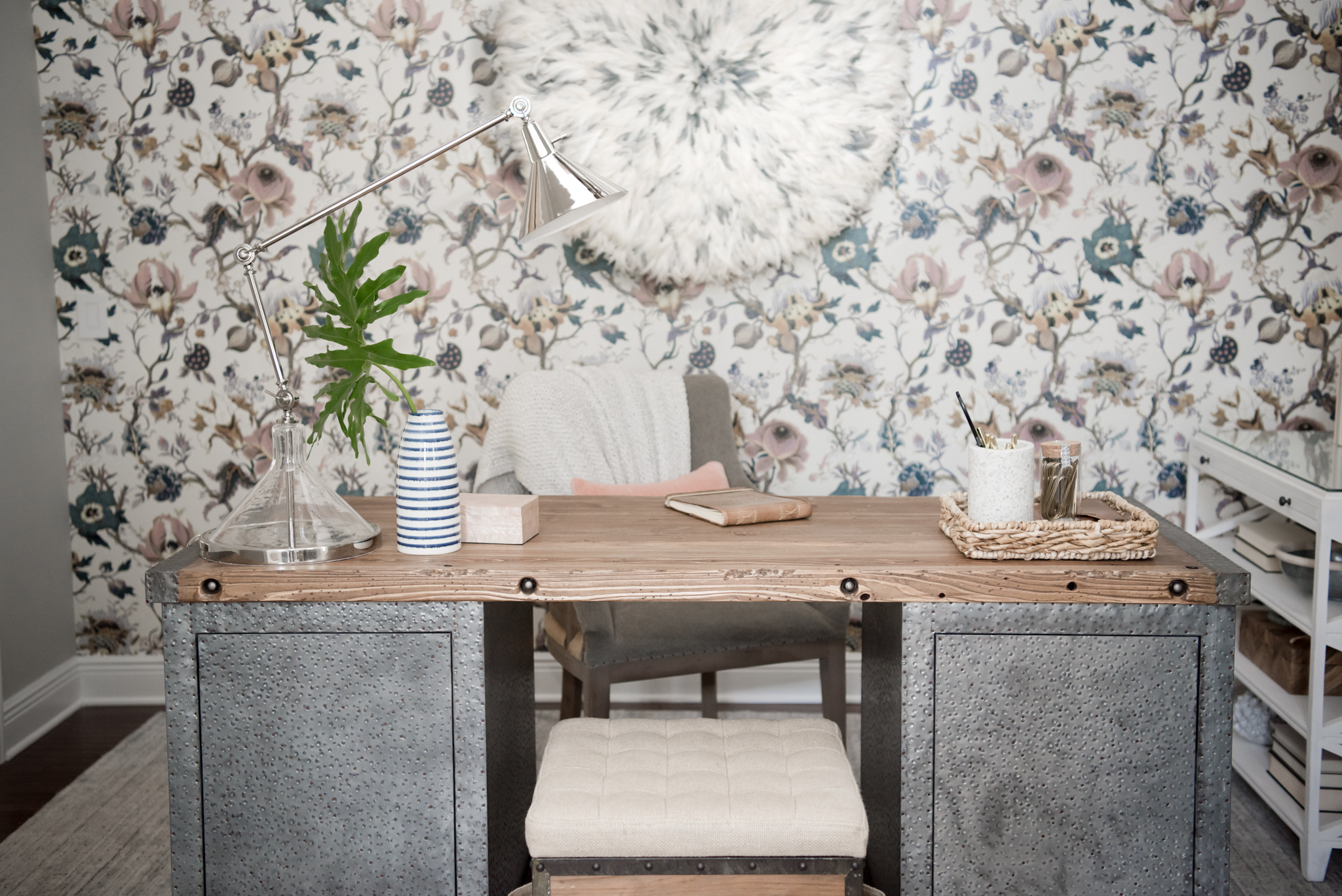
I’m not really a person to take sides. When it comes to design trends I like to remain impartial never diving too deep into one trend or over-using another. At least that’s what I aim for! But when it comes to wallpaper, all that is out the window — I’m I’m OBSESSED, a huge fan,and can’t find many areas it’s NOT a good fit.
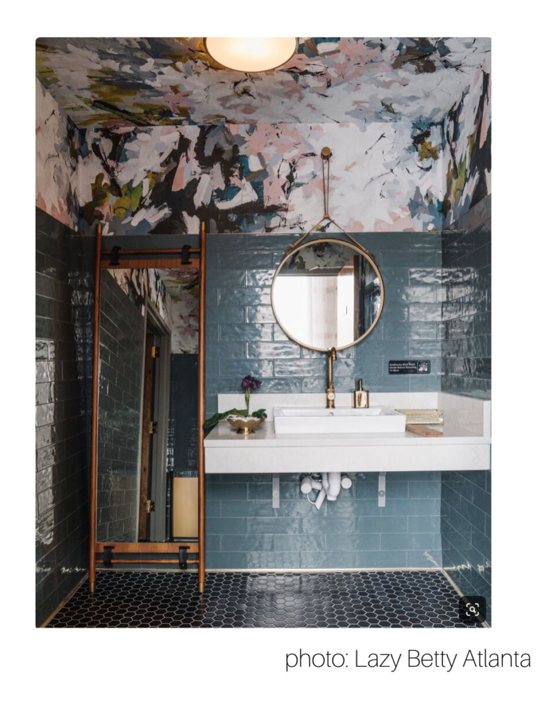
Here are my top favorite uses and lessons I’ve learned… The powder bath is the perfect space to dip you toes in for wallpaper If you are unsure if wallpaper is for you (yes it is) or if it really impacts the space that much (it does), give it a try in the powder bath. How boring is a room with a sink at one end, and toilet at the other? A bold pattern can wake up the four blank walls! Vinyl is a great choice for wet or busy (kid hands) bathrooms. If the bathroom has no shower/ bathtub even better! Your choices for materials have opened up even more. Small rooms are a great place to go for it! Bold colors, patterns and materials are safer here than most rooms.If there is a pedestal sink, the powder room is going to experience more accidental splashing water, so a paperweave or grasscloth might not be a great choice. If it is a wall-to-wall vanity cabinet with back and side splashes, maybe some lower wall wainscoting — grasscloth and other delicate papers should be fine.
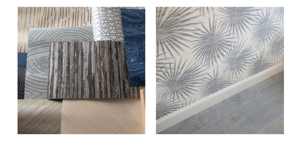
The dining room is another great spot to bring some drama to the walls. Most materials are welcome here—unless your bunch are really messy eaters! Wallpaper can take the place of overusing art, or filling the room with bulky china cabinets.It can make the space feel more cozy, so your guests want to stay and hang out a bit longer. If four patterned walls feel overwhelming, murals can be used in trimmed-out mouldings to resemble artwork. I prefer tone-on-tone colors, small scale patterns and texture here for a little something but still sophisticated.
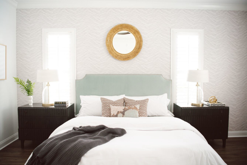
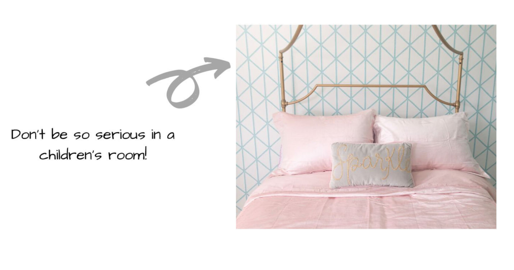
Accent walls or headboard walls are having a moment in bedrooms. I love this trick to add interest without going overboard (you still need to sleep here!) Geometric designs, textures, medium-scale patterns reign here. The beds and nightstands visually eat a chunk of the wall, so it’s only the top portion you see. I like to keep a restrained color palette for bedrooms. Stunning and beautiful but still soothing.
Let’s not forget the 5th wall! The ceiling is a striking way to add a beautiful design feature. The ceiling best for this is without a ton of air vents, can trims or smoke detectors. Look around your house. They are few but they exist! Even a small wallpapered ceiling can be a great transition to another room. Wallpapers with medium scale geometric designs can mimic architectural features like a coffered ceiling. Directional patterns can point your eye toward an entryway. Metallics bounce light around a dark hallway. So many possibilities here! It’s more expensive to wallpaper ceilings, so plan your materials accordingly.
I can’t talk about wallpaper without mentioning to prep and prime your walls first! It’s so important to make sure the wallpaper’s suggested primer is used and walls are properly prepped before hanging. A great primer is Zinsser wallcovering (water- based) and you can tint most primers darker if using a dark wallpaper.
Wallpaper is making a huge comeback, and I’ll be in the front row with backstage passes!
